
AT&T is my home telephone provider. I switched from MCI WorldCom (remember Bernie Ebbers now incarcerated for fraud and conspiracy) because MCI couldn’t understand that they needed to come to my newly constructed home to actually connect the phone wires from the outside of the house to the inside switch box. You don’t want me to start that rant. Let’s just say I will never be a customer of MCI or whatever they’re called, ever, ever again. Not in this or any future life!
Back to the post. My credit card was re-issued with a new number so I needed to log onto the AT&T site and update my payment details. Hadn’t been there in a while because I am enrolled in auto payment and turned off my paper statement. The less I think about my phone company the happier I am.
I typed in att.com and was taken to the home page. When I clicked on My Account I landed here.
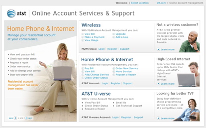
Perfectly attractive page at first glance, but the Cingular acquisition has added complexity. Three places to register, login or get support. Pretty well designed and labeled except for U-verse. What’s U-verse, another planet? In short order I found the home phone section, clicked login, and entered my credentials. So far so good. Since I last logged in they added two factor authentication to the site. Two factor is a federal regulation for some industries and others have adopted it as another layer of protection. It often takes the form of question and answer, knowable only by you. Turns out that when users set them up, they are so secret they can’t even answer them.
AT&T is a case study in why they can’t be answered. Here are the questions offered to me in the drop downs.
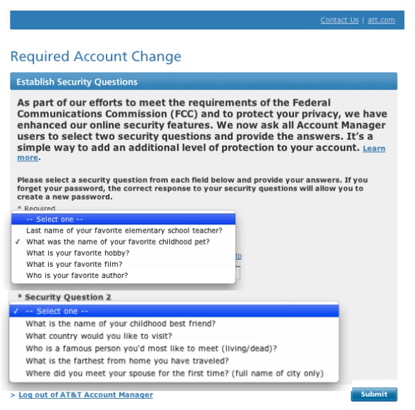
First and foremost best practice site designers need to follow in selecting these questions is the answer should never change over time. Your father’s middle name will always be the same, and very easy to remember, but what country you would like to visit can shift over time. Almost none of their questions pass this test.
This means returning users will have a much higher likelihood of failing to answer the questions correctly, become frustrated and call customer service. The exact opposite result that AT&T and the customer desires. Using personas and goal-directed design techniques would reveal that a meaningful amount of time will pass between logins. Don’t expect users to remember details that they rarely think about. It’s not a test. Back to the drawing board.
![]()
Leave a Reply